Thanks for the introduction,
lets get to the fun
These will help you get up to speed with Netflix concepts. Watching these first are recommended.
How to design a diverse artwork suite optimized for image testing.
Learn more about how we test the assets that you design.
On Product, we demand a lot from our assets. Every image is designed to fit in a variety of templates, localized in over 30 languages, and surface differently to each member depending on their viewing preferences and device. Flexibility is at the core of everything we do to allow for continuous iteration and innovation.
Each asset is a unique opportunity to pull members into content they will love, fueling engagement and delight. As we curate the diverse and high quality suite of assets for each title, we focus on creating imagery that is relevant and meaningful to the title. We are visual storytellers: WHAT is this title and WHY should I watch it?
Width: 2560px
Height: 1440px
JPG
PSD (Layered)
300 ppi
sRGB


Edit Universal Base - Rectangle
Width: 4096px
Height: 2160px
JPG
PSD (Layered)
300 ppi
sRGB
Width: 7680px
Height: 1210px
PNG
PSD (Layered)
300 ppi
sRGB
Width: 6400px
Height: 2416px
PNG
PSD (Layered)
300 ppi
sRGB
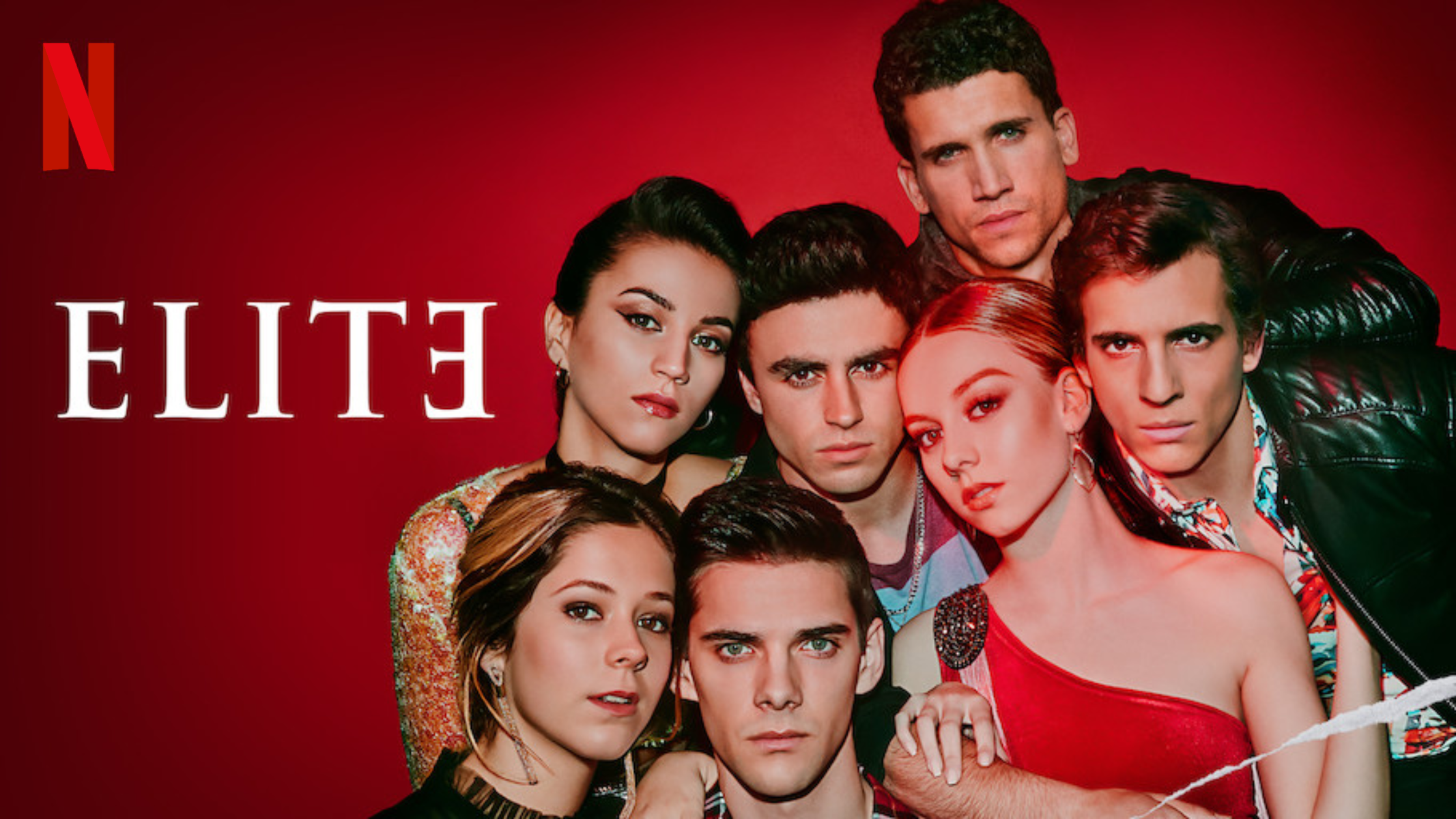
There are multiple techniques to make our logo legible. For example, we can adjust the contrast of the background, blur the background or create a crisp drop shadow behind the logo. We try to avoid very blurry drop shadows and any motion effects behind the title treatment. Special effects and 3D transformation are challenging for title localization, and we currently localize our titles to nearly 30 different languages.

Poor logo legibility

Darker background

Blurry background

Hard shadow and darker spot

Low contrast
There are multiple techniques to make our logo legible. For example, we can adjust the contrast of the background, blur the background or create a crisp drop shadow behind the logo. We try to avoid very blurry drop shadows and any motion effects behind the title treatment. Special effects and 3D transformation are challenging for title localization, and we currently localize our titles to nearly 30 different languages.


Optimizing logos for small sizes is challenging. There are several factors to consider when designing for a small space, including logo-to-background contrast ratio, careful placement of the logo and potential friction with background elements. There's no recipe for designing logos for a small space, but we recommend designing with the navigator window open in Photoshop so you can check legibility in real time.


There are two reasons that logos shouldn't come close to the edge of the box art. First, the preselected box has a frame of a few pixels around it, and we want to ensure viewers can read the full and unobscured title. Second, we don't want viewers to read two titles next to each other as one — for example, "Killer Trollhunters" or "Breaking Bad Avatar."


